Google has redesigned its iconic ‘G’ logo for the first time since 2015, introducing a modern gradient look that aligns with its AI-powered future, starting with iOS and Pixel users.
Google Unveils New ‘G’ Logo After a Decade: A Fresh Look for an AI-Focused Future
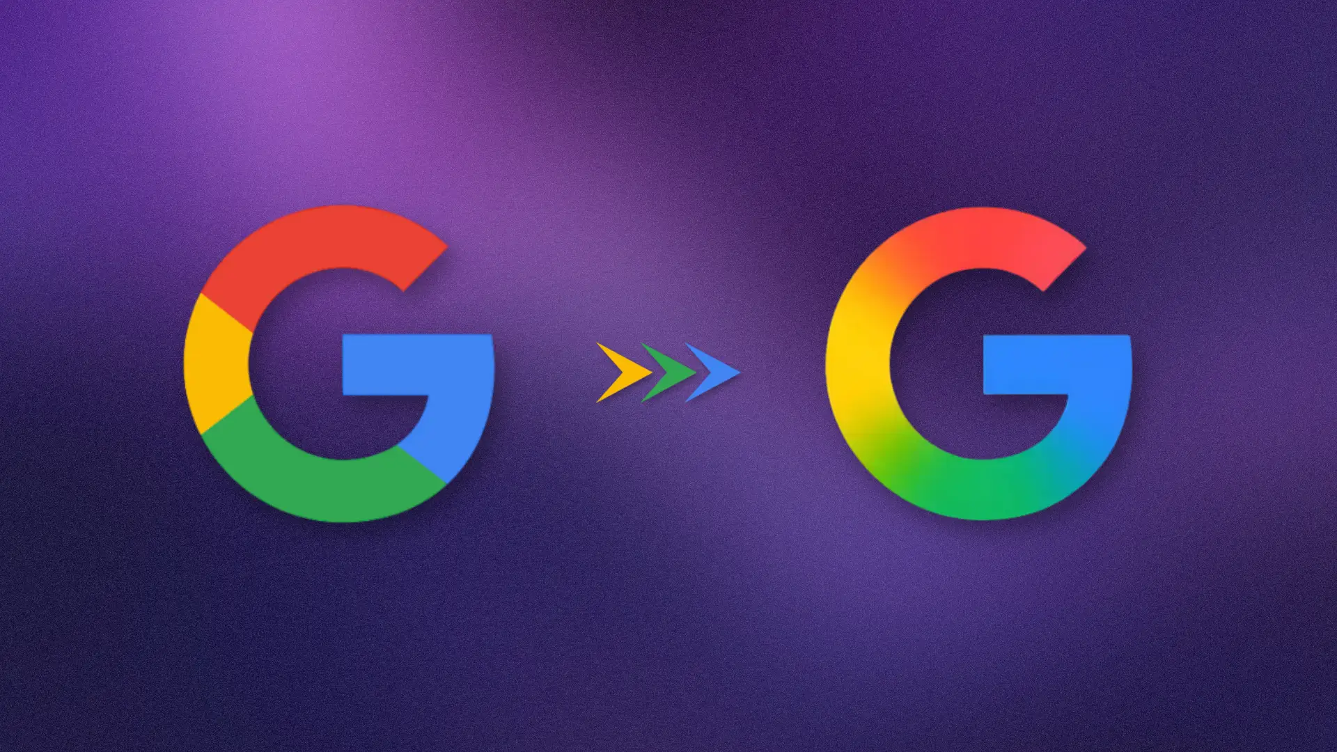
For the first time in nearly 10 years, Google has updated its iconic ‘G’ logo—ushering in a new era of design that reflects the company’s growing focus on artificial intelligence.
Gone are the familiar solid red, blue, green, and yellow blocks. The new logo introduces a sleek gradient design that fluidly transitions between Google’s signature hues. This subtle yet strategic shift marks Google’s most significant visual branding change since 2015.
What’s New in Google’s G Logo?
The updated logo features a soft, modern gradient that replaces the earlier flat-color style. This creates a more vibrant and dynamic effect, making the logo feel more responsive and aligned with modern UI/UX design standards.
- Before: Flat, primary-colored segments
- After: Smooth gradient transitions for a fluid, AI-era aesthetic
While the new design might not look drastically different at smaller sizes, it becomes more noticeable in high-resolution and on newer devices. Google says the change improves cross-platform visibility and adapts better to varying screen technologies.
Why the Change Now?
This redesign is more than a cosmetic update. It’s a strategic branding move to align Google’s visual identity with its AI-first mission. The gradient style reflects Google’s shift towards more organic, intelligent, and fluid interfaces—a look that mirrors its AI tools like Google Gemini, which already uses a gradient-heavy blue-to-purple icon.
As Google’s AI products become more integrated into its core services, this new logo signals a unified branding direction—one that feels modern and tech-forward.
Rollout Timeline: Who Gets It First?
The new ‘G’ logo is now rolling out gradually:
- iOS: Live on the latest version of the Google Search app
- Android: Visible in the Google app beta (v16.18)
- Pixel Devices: First Android phones to show the updated icon
For now, the redesign hasn’t reached the web, non-Pixel Android phones, or desktop environments. Google has not yet confirmed a universal rollout date, but it’s expected that more users will see the new icon over the coming weeks.
Will Other Google Logos Follow?
Currently, there’s no word on changes to other Google product logos—such as:
- Google Maps
- Gmail
- Chrome
- Google Drive
However, considering the company’s clear shift toward AI-driven branding, it’s reasonable to expect similar updates in the near future.
A Global Icon, Evolved for the AI Era
The ‘G’ logo is one of the most recognizable tech icons worldwide. Seen on billions of devices—from smartphone apps to web browsers—any update, no matter how minor, signals a broader brand evolution.
This new design is part of Google’s commitment to:
- Enhance visual consistency across platforms
- Reflect its AI-first identity
- Improve user interface clarity
- Stay ahead in branding trends
Final Thoughts: A Small Change, A Big Message
Google’s gradient ‘G’ logo might seem like a small visual change, but it carries a big message: the tech giant is embracing an AI-centric future and is evolving its visual language accordingly.
As Google continues to roll out tools like Gemini and integrate machine learning into everyday user experiences, this logo update is likely the first step in a larger brand refresh that will define its identity in the 2025s and beyond.